Thursday, May 25, 2017

Adventures in Hand Modeling

Mixing Paint Illustration


As I mentioned in my book, I have always wanted to be a hand model. This came about years ago when I read an article about a woman who did hand modeling. In the article, she mentioned that she wasn't allowed to do the dishes since it ruined her hands. That idea sounded fantastic to me at the time. Washing dishes is one of my least favorite chores because I suffer from eczema and the soap always irritates my hands. Now if I could use the excuse that my hands were too important to do such a mundane chore that gave me itchy hands, I would definitely use it. Hence, my desire to be a hand model. 

So with this book, I became a hand model. I also got to show off my skill of sketching hands from years of sketching my own hands in church, sports events, boring meetings, etc.

Unfortunately, I still have to do the dishes.

The above illustration is from Chapter 5 of Watercolor 365. The chapter is on washes and this is an image of me mixing some paint. 

Here is the painted version:


And the photo:


Monday, May 8, 2017

Mixing Paint into Liquid Form

Mixing Paint into Liquid Form Illustration

Quite often I will mix paint into liquid form so it is easier to use for pours and washes.
The above illustration appears in the book.


Again, I combined a painting with a photo.

This is the painted version


Here is the photo:


Thursday, April 27, 2017

Medicine Dropper Illustration


Medicine Dropper Illustration


Another must have in my studio is a medicine dropper. It is the kind that came with one of the medicines my kids were on when they were young. I find that this dropper is fabulous for adding water to paint to make it more juicy or when working wet-in-wet. A nice drop of water at the right time can make some pretty neat blooms, as that big drop of water pushes pigment away. 

Here is the painted version of the dropper:


Here is the photo that I used for reference and when combining the painted version with it:


Thursday, April 20, 2017

The Disappointing Blow Dryer


Illustration of Blow Dryer

When a book is put together, there sometimes tends to be a few mistakes and other things that are overlooked. One of those mistakes in Watercolor 365 was a mix up with one of my favorite illustrations. Instead of the above illustration of the blow dryer being put in, just the photo made an appearance. 
Did I mention that this was one of may favorite illustrations? I believe I have. So it was a disappointment to discover that it was not in the final book. These things happen though and maybe my blow dryer was just meant for big and better things in the future.
 My favorite part of the whole painting was the shadow. I tried to make it much more interesting than the shadow in the original photo. 

Here is the painted version:


And of course the photo that appears in the book:


Monday, April 10, 2017

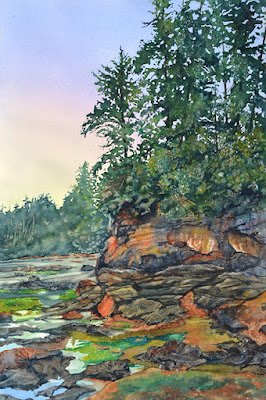
Sylvan Shore

Sylvan Shore
15x22"

Two weeks ago I taught a workshop on how to paint landscapes. For this workshop, I showed my students some fun techniques for painting foliage and rocks. The image I used to demonstrate these techniques was from Botanical Beach on Vancouver Island. This beach is one of my favorite places to visit and I have gotten a plethora of inspiration exploring these shores. 


To begin the painting, it was first drawn out on a half sheet of watercolor paper.  The sky was painted by first wetting the paper, then adding a wash of yellow and a red across the paper on a diagonal. The yellow I used is something new for me - Winsor & Newton's Transparent Yellow. The red is Daniel Smith's Quinacridone Rose. After I did a wash of the yellow and the rose in the top half of the painting, I then added a mix of Cobalt Blue and Winsor Blue to the top and bottom of the painting. This was laid flat to dry. 


After the wash was dry, I masked out the sky area and what I refer to as "sky holes". These "holes" are the bits of sky seen through the trees.
Then I splattered paint, starting with yellow, moving to green and blue and finally to a dark green by adding the rose to the green.  While splattering, I also sprayed the paint to get it to move and blend the colors. I also splattered some burnt sienna and cadmium scarlet into the trees while working with the different greens.


After the splattered paint dried, the mask was lifted and the rocks were painted. To do the rocks, I used burnt sienna and French ultramarine blue. While wet, plastic wrap was placed on top of the paint. This was allowed to dry and the plastic wrap was removed to reveal rocks. I continued to use the plastic wrap to create more rocks, leaving space between them to allow for the water and seaweed. These rocks were further defined by adding darker paint to create more crevices and shadows. Then the seaweed was painted with transparent yellow and Winsor blue, adding a touch of salt, to create texture. 
Finally I painted in the tree trunks to finish off the painting. 


Thursday, April 6, 2017

Cobalt Blue and Cadmium Scarlet Illustration

Cobalt Blue and Cadmium Scarlet Illustration

Two of my favorite colors when combined are cobalt blue and cadmium scarlet. The combination makes for a beautiful sky color, with using pure cobalt higher in the sky and then warming it up with the cadmium scarlet as it moves towards the ground.  I have an illustration of this mix in my book. 

This is the painted version:


And this is the photo:


Monday, April 3, 2017

Hole Punch Illustration

Illustration of Hole Punch


This illustration did not make it into the book but I just loved painting that purple handle and the many colors and the purples and blues of the shadow. That is why I chose to make that part of the illustration the painting and the other part the photo.

As I have mentioned before, I painted each tool from a photo I took, then combined that painting with the photo. 

Here is the painted version:


Here is the photo:

I ended up painting the handle with more blue than in the photo. I did this for a couple of reasons. First of all, the light in the photo washed out the purple color of the handle. The original hole punch is slightly more purple. Second, I liked how the blue in the purple mixture granulated. And finally, I preferred the way the pink of the photo combined with purple in the illustration.


Thursday, March 30, 2017

Mixing The Two Must Have Colors

Illustration of Burnt Sienna and Ultramarine Blue

For this illustration, I chose to have my hand painted and the brush and colors to be the photo.

Here is the painted version:


Here is the photo:


Monday, March 27, 2017

Illustration of Hand Towels


Hand Towels Illustration


Starting in Chapter 4 of Watercolor 365. I started to combine my photos even more with the paintings.

The above illustration is of some of my hand towels that I use when painting.
I prefer hand towels over paper towels because I can just wash and reuse.

Below is the painting:


And here is the photo:


Thursday, March 23, 2017

My Rubber Sole

Illustration of Masking Fluid Pick Up


As mentioned in my book, one way to get masking fluid off is to use a masking fluid or rubber cement pick up. This useful tool is made of some sort of rubber, similar to the bottoms of some shoes. That is why I call it my rubber sole. 

The painted version of it is below:


And this is the photo:


Monday, March 20, 2017

Soapy Water

Illustration of Brush in Soapy Water

This illustration is in the book and it makes it's appearance in Chapter 3. I just loved painting this illustration because of that beautiful blue color of the container. It is a portable water container that flattens out so it is easy to travel with. In the painted version, I did remove the tag on the end of the brush handle. 
Here is the painted version:


And here is the photo:


Wednesday, March 15, 2017

Review of Watercolor 365 by Angela Fehr


The fabulous watercolorist,  Angela Fehr, has featured a review of my book, Watercolor 365, on her YouTube channel.  
I was surprised and pleased with her review as I have known Angela's work for some time. She is another artist from British Columbia and I have featured her work before on my other blog.
You can read that feature by clicking here

To purchase Watercolor 365, please go to Amazon.com

Monday, March 13, 2017

Ruling Pen

Ruling Pen Illustration

(combination of painting and photo)


A ruling pen is an item that can be used to apply masking fluid. It can also be used to draw in ink.


Painting of Ruling Pen


Photograph of Ruling Pen


Thursday, March 9, 2017

Mask Pen Illustration

Mask Pen Illustration
(Combination of painting and photo)


Painted Mask Pen


Photo of Mask Pen


Monday, March 6, 2017

Toothbrush

Toothbrush Illustration

This illustration appears in the third chapter of the book. Again, it is the combination of photo and painting.

Here is the painted version of the toothbrush:
And the photo:

Thursday, March 2, 2017

Rigger Brush

Rigger Brush Illustration

This illustration is mostly seen as a painting in the book since it is only a portion of the illustration.
However, I have shown the combination of the photo and painting above and will show the fully painted version and the original photo.

Here is the painting:


And here is the photo:


Monday, February 27, 2017

Painting Chopsticks


Chopsticks


Chopsticks are not one of my usual art supplies but I did include them in my book. Why? you may ask. Well, you will just have to read the book to find out.

Anyway, I did the above image by combining a painted chopstick with a photo of one. However, the complete image was not included in the book, only a portion of it.

I only had to paint one chopstick and then make it into two.
Here is the painted version:


Here is the photo:


Thursday, February 23, 2017

Hake Hake

Illustration of Hake Brush

Another illustration that did not make it into my book is of a hake brush. I use this brush when I am applying large washes of water and/or color. The above illustration is the combined one of photo and painting.


Here is the painted version:


And here is the photo:


It was a challenge to recreate my supplies as they were in the photograph so I could seamlessly combine them. But as with all challenges, there is an opportunity to learn. Not only did I have the opportunity to perfect painting and drawing skills, but I also had to think about photography, layout and design, and the technical skills involved when playing and working digitally. 

Although I am not a book designer, my editor, Kristin Conlin, requested that I do a rough layout of each one of my pages and entries. I really enjoyed figuring out what to place where and if it was going to work. Once I did the layouts, Kristin sent them off to an actual book designer, Breanna Loebach, who cleaned it up, tweaked it, and did an amazing job of creating such a super awesome looking book. 

Through all this, I discovered how much I enjoy book design and layout as I played around in Photoshop, Illustrator, and InDesign. 
I also rediscovered how much I love color. I tended to paint my supplies just a bit brighter and more colorful.