Showing posts with label paint. Show all posts

Monday, August 15, 2022

Earth Pigments

  This entry was originally posted on Tuesday,  August 14, 2012


There are some gorgeous natural earth pigments that are being made into watercolor paint.

Some of these pigments are Bloodstone, Hematite, and Amethyst.

These pigments do some really wonderful things when working wet in wet.

Since some pigments are heavier then others, some will stay put while other pigments move through and around them, creating wonderful texture.

They are great for painting dirt and earth.


Tuesday, April 26, 2022

Is This the Right Color?

   This entry was originally posted on Wednesday, April 25, 2012

When I teach pouring watercolor classes, I always have a couple of students hold up their paint pots to me and ask,

"Is this the right color?"


What they are really asking is 

"Is this the right value?"


It is difficult to tell what value a color is just by looking at it mixed up in your little container.

The only way to know if you have the right value is to test it on a scrap piece of watercolor paper.

If it is too light in value, you add more paint.

Too dark, add more water.


Monday, April 25, 2022

Don't Taint the Paint!

   This entry was originally posted on Tuesday, April 24, 2012


When I pour paint, I usually use 3 primary colors-

red, yellow, and blue.

These 3 colors are diluted with water into individual containers for pouring.


When mixing paint into liquid form, start with yellow, then move to red, and finally blue.

Or start with the lightest color first.

If you are like me, you don't want to have tubs of clean water all over the place and you don't want to have 3 different brushes to mix with (that will no doubt be mixed up themselves).


Since yellow is the easiest color to taint, start out with clean water and a clean brush.

Then move on to red.  And finally blue.

If the water is yellow or a bit of yellow is stuck in your brush, it won't matter as much when mixing it into a darker color.

However, if you start with blue and then move on to yellow, you may end up with green instead.


Tuesday, January 25, 2022

Oh No! My Palette is Leaking!

 This entry was originally posted on Wednesday, January 25, 2012.


Now that I have recommended that you spray your palette to keep things fresh, every time you go out, it leaks. 

That is actually why I switched to a travel palette even when I am just going to the local art center to teach. 

But my palette still was leaking and getting all over my supplies. Then they get messy and sticky and it was such a nuisance.

Simple solution: put it in a zipper bag

No more messes.

So obvious yet I am surprised how often it is not thought of and how long it took me to think of it!

(My practical genius only appears once or twice a year)

You can do the same with your big palette. Keep it in a large bag separate from everything else and keep it flat if you can. 


Monday, January 24, 2022

Paint Properties

 This entry was originally posted on Tuesday, January 24, 2012.

If you really want to know the properties of your paint, each manufacturer posts that information on their website.  Makes life so much easier having that information right in front of you.

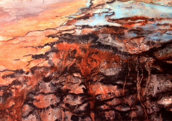
My favorite brands are Winsor & Newton and Daniel Smith.

Winsor & Newton is consistently the best brand out there. It is well known for their watercolors and I like how clean their colors are. I don't feel like they are too heavy or chalky with pigment or filler.

 Just look for your color then the T/O on the chart. 

T = transparent

O = opaque

 The chart can be found by clicking Winsor & Newton Watercolors


My other favorite brand is Daniel Smith. Their colors are so rich and creamy right out of the tube. Plus they have the coolest names for their paint. Wouldn't that be a great job? They are like the OPI of watercolor. 

The quinacridones are especially wonderful to work with.

 Their chart is actually a color wheel. If you click on a color, it tells you not only its properties but what other colors it goes well with. Very helpful.

*Update:

Daniel Smith no longer has the color wheel that is mentioned above. However, they have another color wheel that can be found here

They also have some helpful color charts that explain the properties of all their wonderful colors. 

These charts can be found here. 

Sunday, January 23, 2022

Transparent vs. Opaque

 This entry was originally posted on Monday, January 23, 2012.

The next question you probably asked after my post about mud was 

"How do I know which of my paints are transparent and which are opaque?"


One simple test is to draw a line with a black permanent marker (like a Sharpie pen).

Now paint a line of each color over the black line. If you can no longer see the color, it is transparent.

If you can see the color on top of the line, it is opaque.

It may be hard to see from the photo but Cadmium Scarlet, French Ultramarine Blue, and Yellow Ochre are sitting on top of the line. This means that they are more opaque than the others. 

I put both Raw Sienna and Yellow Ochre on the chart to show my students the difference. They are similar in color but different in transparency. 

Each brand of paint also has a difference in transparency. For instance, I find that Winsor & Newton's Burnt Sienna is more transparent than Daniel Smith's. 

Friday, January 21, 2022

How Did I Get Mud?

 This entry was originally posted on Saturday, January 21, 2012.

It happens to all of us at one point or another.
We paint mud without wanting to paint mud.
This is perhaps the biggest frustration with beginning watercolorists.
So how do you not get mud?
The secret is to know the qualities of your paints.

Watercolor is an inherently transparent medium. However, there are some colors that are more opaque than others. It is by knowing which colors are which that helps you to understand how to stay away from mud.
How does this help?
The opaque colors tend to sit on the surface of the paper.
So you put a wash down with an opaque color and you want to do another wash on top of that. Instead of staying in the fibers of the paper, that opaque color will lift and mix with that new wash. Next thing you know, that beautiful clear color has turned to mud.
So you can do one of two things:
Don't mix too many opaques together when mixing colors and
Leave your opaques for the top washes.

Monday, January 17, 2022

Arranging Your Palette

 This entry was originally posted on Tuesday, January 17, 2012.


One question I get asked by beginning watercolorists is about how to arrange the colors on a palette.

When arranging your palette, it is best to put all your yellows together, then all your reds, and finally all your blues. I also like to keep my colors that I mix often close together (such as French Ultramarine Blue and Burnt Sienna)

I also always position my palette the same way when I paint. I now know where each one of my colors is and I don't have to think about which color is which while I am painting.


Sunday, January 16, 2022

The Two Must Have Colors

 This entry was originally posted on Monday, January 16, 2012.

I know I said that you can choose your colors for your limited palette but I feel that there are 2 colors that are absolutely essential to any palette, especially if you are a beginner.

These colors are French Ultramarine Blue and Burnt Sienna.

I also call these 2 colors US for Ultramarine, Sienna.

They are extremely universal and versatile.

You will notice that these two colors are used by many of the great watercolorists, including John Singer Sargent.


There are many reasons why I use these colors but that will be discussed later.


Thursday, May 25, 2017

Adventures in Hand Modeling

Mixing Paint Illustration


As I mentioned in my book, I have always wanted to be a hand model. This came about years ago when I read an article about a woman who did hand modeling. In the article, she mentioned that she wasn't allowed to do the dishes since it ruined her hands. That idea sounded fantastic to me at the time. Washing dishes is one of my least favorite chores because I suffer from eczema and the soap always irritates my hands. Now if I could use the excuse that my hands were too important to do such a mundane chore that gave me itchy hands, I would definitely use it. Hence, my desire to be a hand model. 

So with this book, I became a hand model. I also got to show off my skill of sketching hands from years of sketching my own hands in church, sports events, boring meetings, etc.

Unfortunately, I still have to do the dishes.

The above illustration is from Chapter 5 of Watercolor 365. The chapter is on washes and this is an image of me mixing some paint. 

Here is the painted version:


And the photo:


Thursday, April 6, 2017

Cobalt Blue and Cadmium Scarlet Illustration

Cobalt Blue and Cadmium Scarlet Illustration

Two of my favorite colors when combined are cobalt blue and cadmium scarlet. The combination makes for a beautiful sky color, with using pure cobalt higher in the sky and then warming it up with the cadmium scarlet as it moves towards the ground.  I have an illustration of this mix in my book. 

This is the painted version:


And this is the photo:


Saturday, February 4, 2017

Quinacridone Rose


While writing Watercolor 365, I got the idea to paint some of my favorite supplies. The book starts out with photos of my supplies and then they slowly turn into paintings. 
Last summer I posted some of the supplies I had painted on my other blog, Leslie Redhead Fine Art.

A few of these paintings made it into the book, others did not. Now that the book is out, I thought I would post those that did not. 
Quinacridone Rose is one of the paintings that didn't make it in. However, I just love this color. It works well in mixes and even better alone.